Logo development
A mark that survives being 16 pixels wide and being three metres tall on the side of a trailer. In colour, in one colour, and in the variants each of those needs.

BeetleOPS services · Brand
Visually cohesive brand identities that communicate what your organisation stands for, with clarity and impact.
What this is
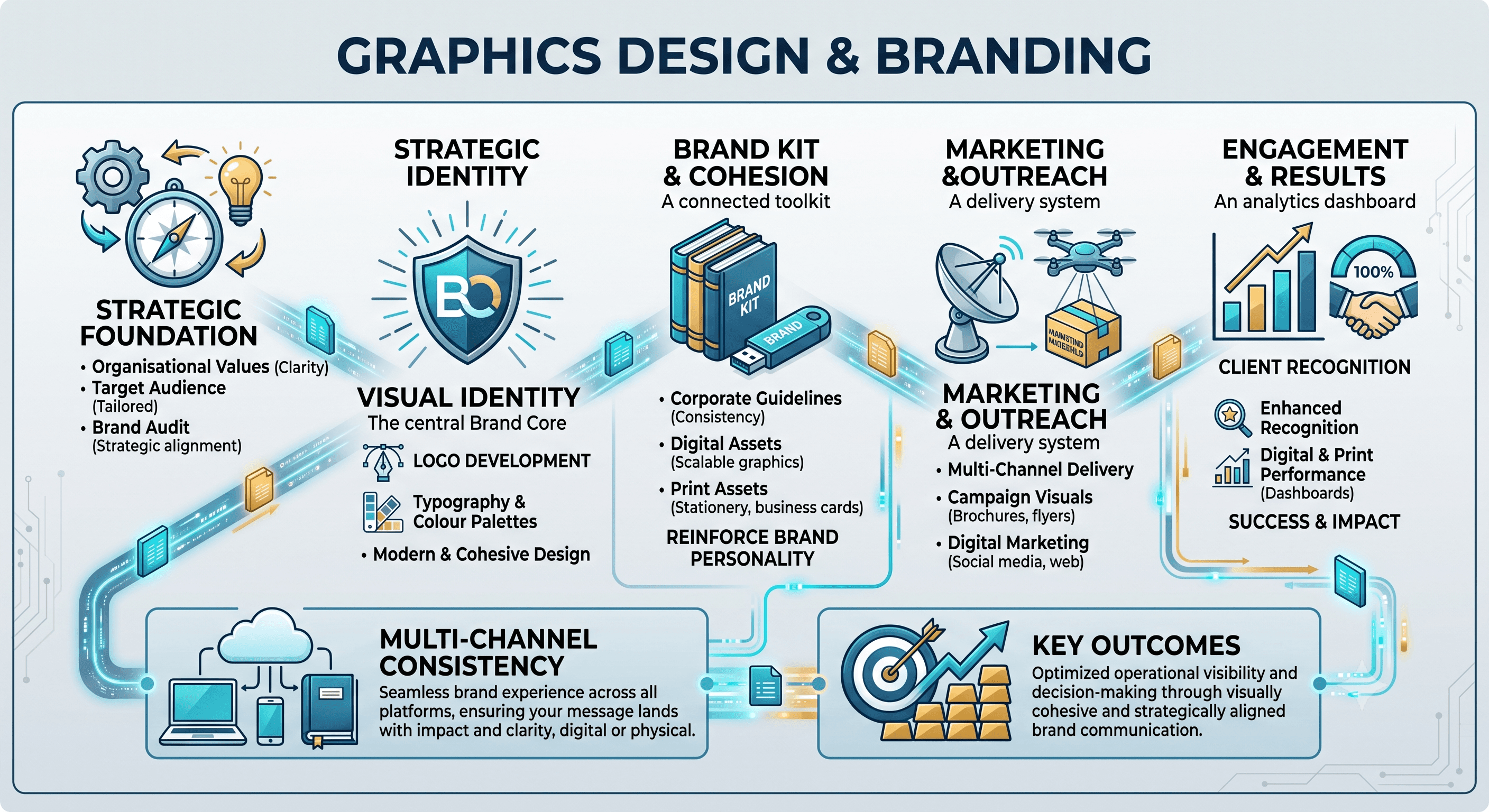
Brand identities built to be recognised, and a kit that keeps them consistent wherever they are used
From logo development and corporate brand kits through to marketing material and digital assets. The test is simple: your invoice, your trade stand and your app icon should all look like they came from the same business.
One identity. Every surface.
A mark that survives being 16 pixels wide and being three metres tall on the side of a trailer. In colour, in one colour, and in the variants each of those needs.
Palette, type, spacing, logo lockups. Packaged so the printer, the agency and your own team can all get it right without emailing you first.
Decks, one-pagers, brochures, trade material. Laid out to be read, and easy to update when the offer changes in six months.
Web and app imagery, social templates, email headers, icons. Sized and exported for where they actually end up.
Stationery, signage, vehicle and warehouse graphics, prepared to the printer's specification. What turns up should match what you approved.
The rules written down, including the things not to do. An identity has to survive contact with everyone who will ever apply it.
The business, the audience, the competition. Every design decision later on has to point back to something here.
Direction before detail. You get territories to react to, not one finished logo presented as a fait accompli.
The chosen direction becomes the mark, the palette, the type and the lockups. Tested at the sizes it will really appear at.
Applied to the material you actually need first. This is where an identity either holds together or falls apart.
Source files, exports and guidelines, handed over. The brand is yours to run, with or without us.
Bring the logo, the deck and the last thing you had printed. We will tell you what is worth keeping.